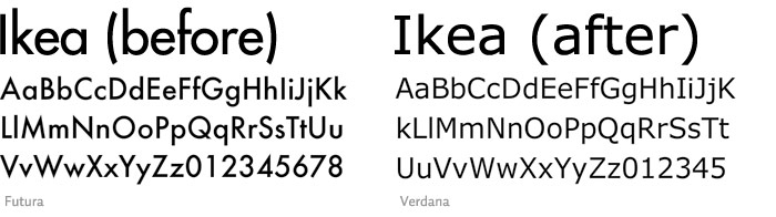
Look at Futura's near-perfect bowls in the o and p and q. I think Verdana is a little confused as to whether to be a serif or sans-serif, i.e. I and J. (Also known as a humanistic typeface) Microsoft needs to stop re-designing timeless typefaces.
I love the fact that there is a petition for Ikea to change back to Futura. The reasoning behind this horrendous act is because Verdana is better for print + web. Last I read, there were 2,000+ people who signed the petition.
Gotta love them typophiles.
i noticed this too! back to FuTURA please.. i think it just suits ikea in general.
ReplyDeleteandd YES! i do have a typewriter. It's a Royal Quiet DeLuxe portable that came with it's own black carrying case. It's absolutely divine.